
Rhythm and Harmony Can Bring Your Interiors to the Next Level
The words “rhythm” and “harmony” likely bring music to mind, but these are also terms that interior designers use to describe our work. If you’ve ever wondered what it takes to design a cohesive and interesting room, you’ll want to study these design principles.
Rhythm
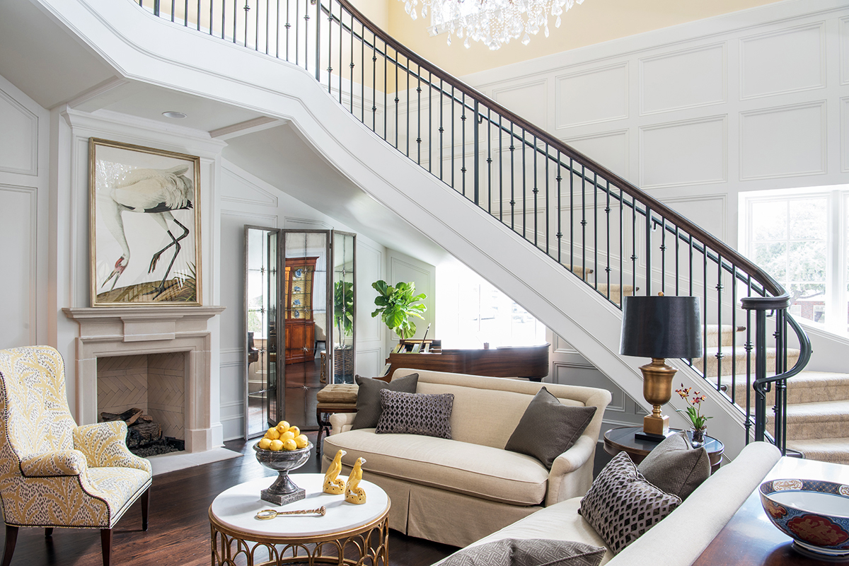
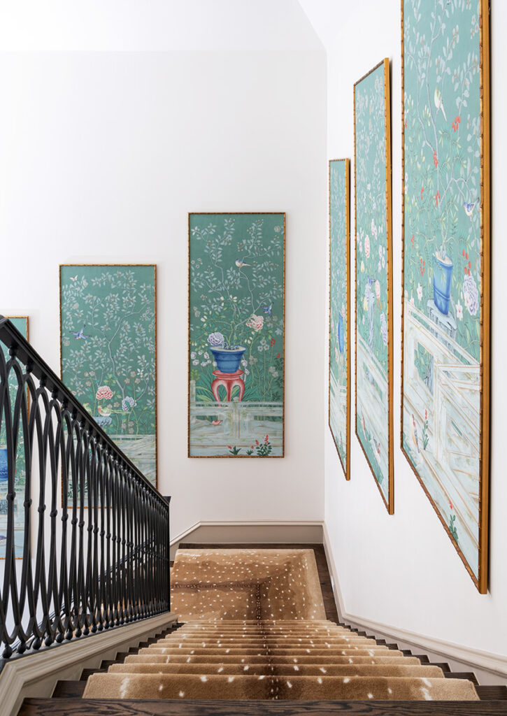
You can lead a viewer’s eye throughout the room by repeating a pattern or color among your furnishings and accessories. This kind of visual flow is called rhythm. The use of rhythm can be subtle: For example, a particular shade of yellow in a painting could be echoed in the pillows on the sofa.
You can also create interest through progression, in which you line up your accessories from large to small, small to large, or even from light to dark in tone. A series of similar but differently-sized vases in an entryway is a charming example of progression.
Harmony
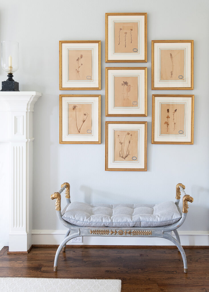
Another way to achieve balance in your interiors is through harmony, in which all the elements of your space relate to each other in a pleasing way. A room has harmony when almost everything in it is part of the same color family: in other words, a monochromatic color scheme.
While a room with contrasting colors and rhythm is exciting, a room with harmony is especially restful. Monochromatic color schemes are great for rooms you want to relax in, such as the bedroom. A symmetrically designed room will also feel more harmonious than an asymmetrical room.
You don’t have to make everything in your room all of one color to achieve harmony. Generally, 60% of the room should represent your dominant color, 30% should be your secondary color, and the last 10% should be for accents. Distributing similar textures throughout your room will also help: from coarse textures like brick and timber paneling to smooth textures like polished concrete and glass.
Now that you’ve read about a few examples of rhythm and harmony, hopefully, you can approach your interiors with a fresh eye and see where you can make improvements. Keep in mind that you need the right amount of contrast to avoid ending up with a boring design.


