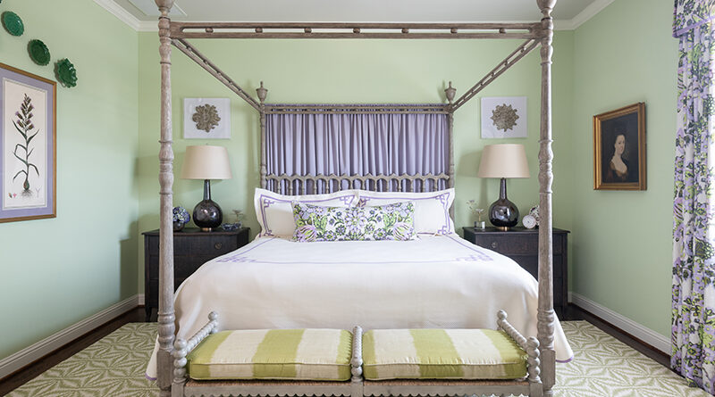
Working with Bold Colors: Four Tips for Color-Shy Homeowners
Although bold colors have been trending the last few years, many homeowners wonder, “How much is too much?”
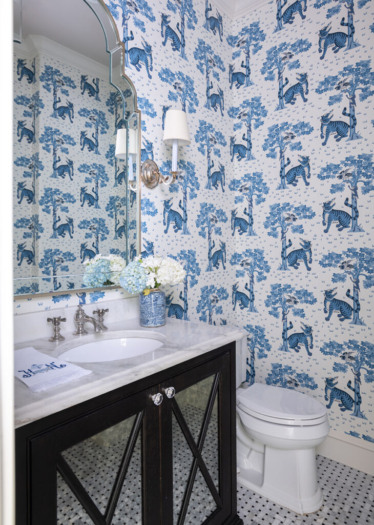
In my design work, I have been including more color lately. I thought that readers would appreciate some tips on working with bold colors in a balanced way.
Starting small
If you’re new to using bold paint or wallpaper colors, try them in a smaller space like a powder room first. Brightly colored accessories such as throw pillows, stools, ottomans, blankets, etc. also can be swapped out easily or repainted if you get tired of them.
Picking the dominant color
The size of your room determines how much color you can comfortably accommodate. In a large room, it would be overwhelming to use a bold paint color on all four walls. In small and medium rooms, however, you can get away with a bold base color.
Some colors can function as neutrals, even if they aren’t traditionally thought of as such. For example, navy blue and moss green are soothing to the eye and often used as base colors.
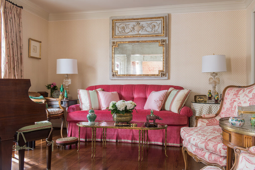
Picking your secondary colors
Before you commit to a bold color, pick out your secondary colors to go with it. One good formula is to have 60% of your room be in a neutral color, 30% in a stronger color, and the last 10% for your boldest colored accessories.
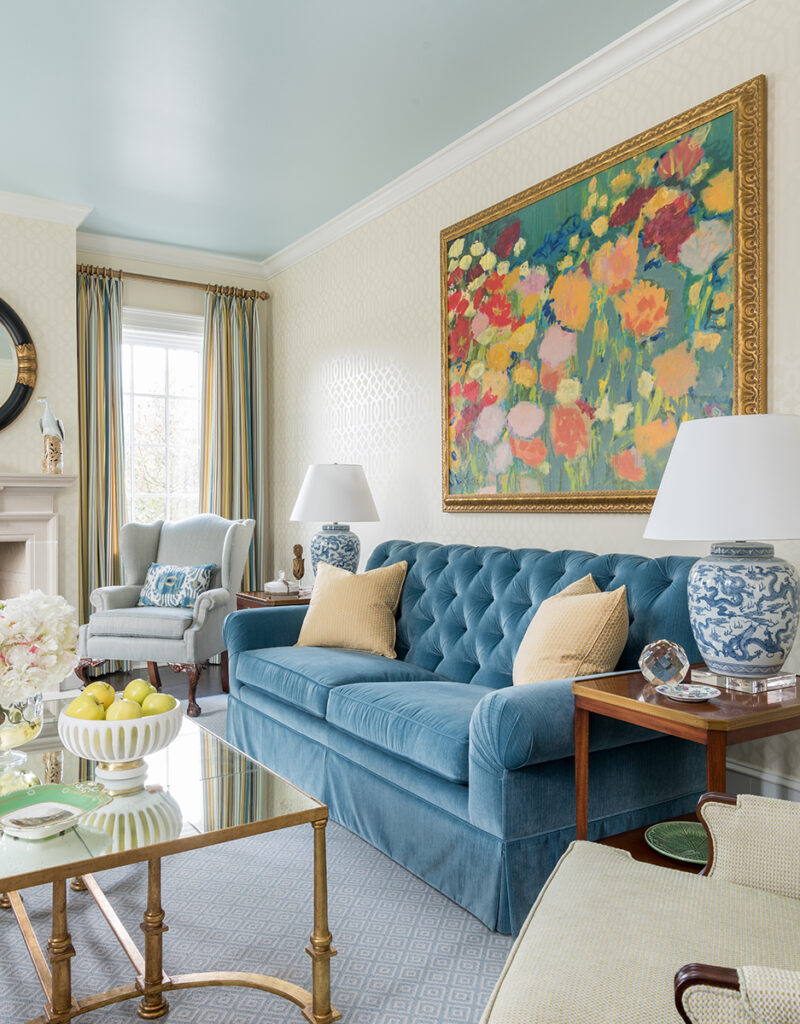
You can get away with very vibrant shades of blue by pairing them with white. After all, it’s a color combination that our eyes are used to seeing — think of white clouds in a blue sky. If you want your room to be energizing, decorating with one bold color and lots of black and white will give you the high-contrast look you need.
For balance and depth, use different, less-intense tones of your boldest color throughout the room.
Coordinate the rest of your home
While not every room in your home needs to have the same color scheme, it’s important that the colors flow naturally. For example, if your sitting room has green walls and white accents, the next room over could be mostly white with bright green accents.
Although every year sees new colors come into fashion, try not to focus exclusively on what’s trending. A room with a well-balanced, aesthetically pleasing color scheme will always look great no matter the year.
Click here for more Living Well content

For nearly 40 years, People Newspapers has worked tirelessly to tell the stories—good, bad, and sublime—of our neighbors in the Park Cities and Preston Hollow. To support our efforts, please contact advertise@peoplenewspapers.com for advertising opportunities. Please also consider sharing this story with your friends and social media followers.

